If/Else If
-
If and else if work fine the way the are now as far as I know, but the else if system doesn't look good to me, it's a bit buggy visually in the behaviour editor mainly, it doesn't always completely attach to the main If and it doesn't move behaviours under it when the main If is dragged around. (Small video example of this below)
AA9B6E0C-DBB8-4240-93D9-583973E9319D.MP4
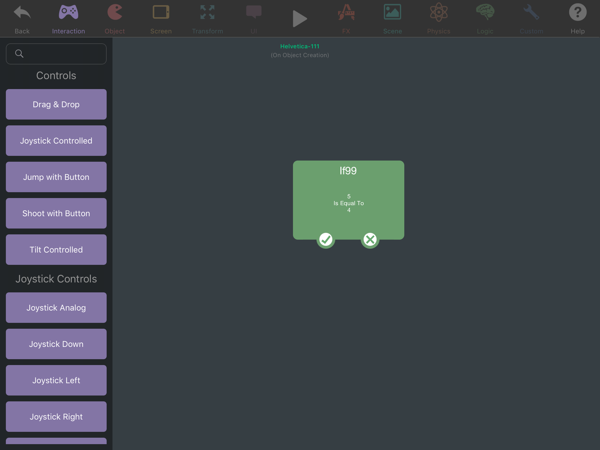
It would be good enough if these minor visual bugs were fixed, but here's a possible idea for an alternative if/else if system:

The tick part is if the statement is correct, the cross part is exactly the same as attaching an Else If with no condition (it outputs when the tick doesn't). I'm not exactly sure what it would look like as you attach multiple behaviours under each connector, maybe the behaviour would just keep getting wider as normal, with a tick or cross above every single behaviour connector line, and all the crosses will always arrange themselves to the right side while the ticks always arrange themselves to the left. -
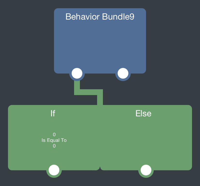
@Jack8680 had another good idea for this: Else If is not a separate behaviour, but instead is a toggle switch inside the If behaviour, switching it on extends an extra part of the If behaviour similar to how Else If is attached to it.
-
I like the first idea better. If you put it in the behaviour properties, it is hard to visually see your flow of logic
@Hamed to clarify, my idea was similar to the current if/else if system, but with a toggle to make the else if appear, and only one wire connecting both of them. Something like this:

Hello! It looks like you're interested in this conversation, but you don't have an account yet.
Getting fed up of having to scroll through the same posts each visit? When you register for an account, you'll always come back to exactly where you were before, and choose to be notified of new replies (either via email, or push notification). You'll also be able to save bookmarks and upvote posts to show your appreciation to other community members.
With your input, this post could be even better 💗
Register Login