hyperPad hyperPad Forum
    • Categories
    • Recent
    • Tags
    • Popular
    • Users
    • Search
    • Login
    1. Home
    2. Faileas
    3. Best
    F
    • Profile
    • Following 0
    • Followers 2
    • Topics 4
    • Posts 12
    • Best 5
    • Controversial 0
    • Groups 0

    Best posts made by Faileas

    • Establishing Theme

      This topic is in response to a comment from 54rush:

      “Something I really wish I did better was create themes. For example, your theme is obviously robot/future themed. I was wondering if you had any ideas for what I could do to my game, My Army Is Better, in terms of graphics and conveying information more smoothly? Might be a stupid question, but I simply create regular rectangle buttons whereas yours are associated to a specific theme.”

      That is definitely not a stupid question. When it comes to a project like Robo Blue, I find that I spend more time figuring out the theme/look/graphics/user interface design than I do on the actual coding. I’m afraid I don’t have a step-by-step method for tackling these aspects of a project but I’m happy to pass along some of the things I’ve learned.

      • Try to come up with one or two key concepts that define the feel of the overall project. The current look of Robo Blue is based on the concepts of “sci-fi” and “mechanical.” This has ended up being a rather different look than my initial versions with the concepts “blueprints” and “control board.”
      • Once you have your key concept, consider what graphic elements come to mind when you think of it. For me, this usually means starting with clichés or stereotypes. Regardless of whether or not they are accurate, they usually exist because many people associate them with a given concept. For example, I used the image of a gear several times in Robo Blue to emphasize the “mechanical” concept. It starts on the main page with the button for the Options screen but quickly shows up again as the item of interest on each level, as a core element in the design of the robot, and in the short-lived blue echoes left behind by the robot when it hits an action icon. I’m going to hazard there aren’t a huge number of gears sitting about most spaceships – steampunk versions aside – but it gave the feel I was looking for.
      • If you are having trouble coming up with ideas as to how to graphically suggest your key concept, try Googling for images with your concept as the search term. Are there any components that show up repeatedly? Try adding “art” as an additional search term; it can help refine the search to what other people think describes the concept. Searching for “sci-fi” and “sci-fi interface” I see many images with blue or blue-gray color combinations, glowing blues, random small writing, and light flares. You’ll find all of those in Robo Blue.
      • Never underestimate the importance of finding the right font. There are several websites you can use to rummage through fonts. Two I’ve used are:
        • https://www.fonts.com/ Search using your theme topic for a variety of fonts that might be what you are looking for.
        • http://www.identifont.com/ Used to figure out the font you’ve seen if you don’t know the name, but if you have a feel for what you’d like the font to look like you can try working through “Fonts by Appearance” to see what suggestions come up. It can also search “Fonts by Similarity” if you have a font that is almost, but not quite, what you want.
      • Be consistent in the color and style of your graphics. I used a variety of illustration styles when putting together Mutton Hunt simply because I was experimenting a bit with different looks and didn’t get around to really cleaning it up. I find that variety jarring when I play because various components don’t look like they go together. If you use a very different color, do so with a purpose. It’s a good way to draw attention to something you want the player to focus on.
      • Think about how your theme can make the game more fun. How can it be used to emphasize actions being taken or the damage associated with a hit? Is it fun to watch?
        Designing your user interface is a whole topic in and of itself, but here are a few thoughts:
      • Decide whether you are going to use words or icons. Be consistent in your choice.
      • If you have a button that is repeated across screens, keep it the same and try to keep it in the same spot each time.
      • Use graphics to group components of the interface if applicable.
      • Try laying out the buttons and information in a prototype and have people play test it. Try it out yourself after leaving the project alone a few days. Is it easy to find what you want?

      So to finally get around to applying these to 54rush’s game, My Army Is Better, I’ll offer the following:

      • What’s your key concept? If it’s “armies,” what time period or genre do you have in mind? Judging by the types of weapons I’m going to assume modern day but you might have other ideas. That said, when I think “modern army,” my first thoughts are a) army green wooden crates with stenciled writing, b) shiny/black metal equipment, c) and woodland camouflage. (Keep in mind that I have no military background so this is going right back to the concept of stereotypes…)
      • One idea for a much more graphical interface would be to set out the various daily options across an image of the city / army compound. Recruiting and Training could be grouped near the central complex, Customize Army might be at the supply depot, Help the People is out in the city, and Go to War Early is outside the city walls. Maybe tap the clock to end the day instead of Speed up Time? (Is there a game play reason other than Productive Time that would make the option of speeding up only one hour at a time more useful than just ending the day?) I’m not sure where Upgrades and Skills would go. So there’s that. It may not but a good idea, but it’s an idea...
      • I like that the time remaining in the day is shown prominently but the analogue clock doesn’t fit with my expectations based on a “modern army” theme. Maybe switch it to digital, complete with the digital clock font?

      That’s my two cents. I’m quite certain there are excellent articles out there that discuss these topics from the perspective of someone who deals with them professionally. If you know of any good ones – or if you’d like to share the way you tackle these issues in your projects – please add to the discussion here! Thanks.

      posted in General Discussion theme game design graphics
      F
      Faileas
    • RE: hyperPad 1.17 is here!

      I just want to say that I am really enjoying having arrays. Thanks!

      posted in Announcements
      F
      Faileas
    • Robo Blue

      Hi all,

      The "work in progress" version of Robo Blue is now available on the Hub. I have some plans for re-writing a large amount of the code in an attempt to make it more efficient but before I tackle that I was hoping to get some feedback on the game play. This way I can implement any good ideas as part of the pending overhaul.

      A few items of note:

      • There are only five levels available so upon completion of Zone A Level 5 it will not open up any others.
      • In the actual game I plan to limit the action icons (e.g., the arrows) to those needed to solve the level plus one or two extras. Right now there are several extras in the later levels because I think it's fun to just play around a bit. (Alternately, I could have several extras in place but include achievements for completing the level using the minimum number of action icons...)
      • The hint boxes show one way of solving the level. It's not necessarily the only way.
      • I have plans for additional complications in later sections, including laser barriers, doors that can be activated, and power stations for refilling the robot's energy... but I'm definitely open to other ideas.

      Thank you very much in advance for any suggestions/recommendations/constructive criticism/etc. As a side note, if by some small chance you played a game I had on GamePress called Hench you may find Robo Blue to be somewhat familiar.

      posted in WIP and Showcase
      F
      Faileas
    • Land of the Cyclopean Deathpiggies!

      It never ceases to amaze me how different my games turn out compared to my initial ideas so I thought it might be fun to chronicle that evolution this time around.

      Part I: The Idea

      Zombies + Lack of Coding Confidence + Greek Mythology + Questionable Artwork + a Young Child = Cyclopean Deathpiggies

      Nobody has ever asked me where I get my ideas but I trust that someday I’ll be a rich and famous game developer who is asked that All the Time and so I figure I’d best start practicing my answers now. Some years back I played a game called Zombie Dice. In short, it involves rolling dice in an attempt to eat brains and not get blasted by shotguns. The dice have different colors, with the shotguns being a more likely outcome on red ones, less so on green ones, etc.

      I wanted to try creating a similar “press your luck” type of game that requires players to routinely decide whether or not they are willing to risk their gains for a chance at greater reward. The first change I decided to make to the Zombie Dice concept was to add a game mechanic by which the Bad Outcome could occasionally be countered. The second was to add a selection mechanism by which the player had a level of control over the amount of risk being taken. The third was to portray the game through cards instead of dice… largely because I didn’t think I could do dice justice from a coding standpoint. Cards, on the other hand, would be easy.

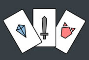
      Then came the theme. I’m a firm believer in the idea that the right theme can elevate the game’s fun-factor considerably. Given that I’d been playing Minotaurus quite a bit at that time I had Greek mythology on my mind and decided to try something along those lines.[1] Teams of Greek warriors could be charging through a labyrinth, trying to collect gems and avoiding the minotaur within. A few minutes later I had my first card icons: a gem, a sword (for fighting off the minotaur), and the minotaur itself.

      0_1477010324306_V1-CardIcons.jpg

      The initial version of the game in hyperPad was simply five cards that you could flip over and which were randomly assigned a status of gem, sword, or minotaur. You had to reset the game to play the next hand and all scoring/rules/what-have-you were handled by the humans involved. It was sufficient; my initial playtester (age 5) insisted on playing it for a good 20 minutes. The only real catch was that said playtester also wanted to know why there was a pig on the cards. I pointed out it was a minotaur. She pointed out it didn’t look much like one. (She, too, had been playing Minotaurus.) A pig it was then, but it needed to be a pig with gravitas; a pig to worth fearing. Hence “Deathpig,” which – when chanted repeatedly by a 5-year-old – quickly turned into “Deathpiggy.”

      And yet it felt like it was still missing something. One adjective later we had “Cyclopean Deathpiggies.” I didn’t have a good reason for tacking on “Cyclopean;” it just sounded fun. In retrospect I think I was subconsciously still trying to slip Greek mythology in there somewhere. Then came the hard question: “Jungle of? Island of? Land of?” The last option seemed to roll off the tongue best when being said with a proper Pulp Adventurer sort of voice so there it was: Land of the Cyclopean Deathpiggies!

      The next step was to flesh out the game a bit…

      Footnotes:
      [1] I wouldn’t say that I play games because I want to be better at making games; I just like to play lots of different games. Still, it is a great way to get ideas, to see what works, to learn what doesn’t, and to discover interesting and different ways to approach various concepts.

      posted in WIP and Showcase game design theme
      F
      Faileas
    • RE: Land of the Cyclopean Deathpiggies!

      Part III: Brainstorming Screen Layouts

      I’ve had a few ideas about how I might arrange things to make the screens more interesting visually (and to accommodate some of the changes I want to make with the game.)

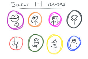
      First up is the Player Selection screen. I’d like to get away from using Player One, Player Two, etc., so I’m considering use of characters. Each player could select a character they’d like to have representing them (not unlike Clue.) If only one character portrait was selected this would initiate a single player game vs. an AI. If two to four portraits were selected then it would initiate the multiplayer version of the game.

      0_1477844414259_V2-PlayerSelect.jpg

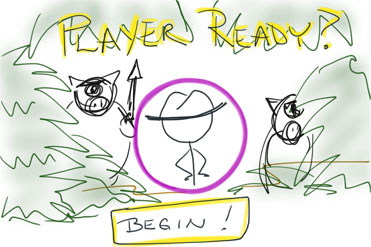
      The Player Ready screen would use the character portrait to indicate which player goes next.

      0_1477844427919_V2-PlayerReady.jpg

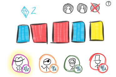
      And the character portraits would appear on the bottom of the game screen along with their collected gems so you can tell how everyone is doing when it is your turn. (The active player’s character would be highlighted.) Another change to the game screen would be to eliminate the current pig counter – which is confusing at best – and replace it with a visual representation of the three members of the expedition team. One team member would be crossed off for each uncountered pig attack. If the third member is crossed off then the team and any gems they collect have been lost. I considered coming up with character portraits for the team members as well but I think I’m going to leave them as faceless NPCs. From the view of the narrative they are replaceable and only as important as any gems they might have. Also, this way I won’t end up getting too emotionally attached to them and decide to bring them safely home when the better play would be to send them out for another round of gem gathering.

      0_1477844443583_V2-GameScreen.jpg

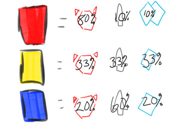
      Finally, there’s the updated Help/Pause screen. The list of rules is going away because there will be an in-game tutorial to explain how to play. In its stead would be a cheat sheet of the likelihood of each result for each type of card... whatever they end up being.

      0_1477844456706_V2-HelpScreen.jpg

      posted in WIP and Showcase
      F
      Faileas